Better UI design - better user experience
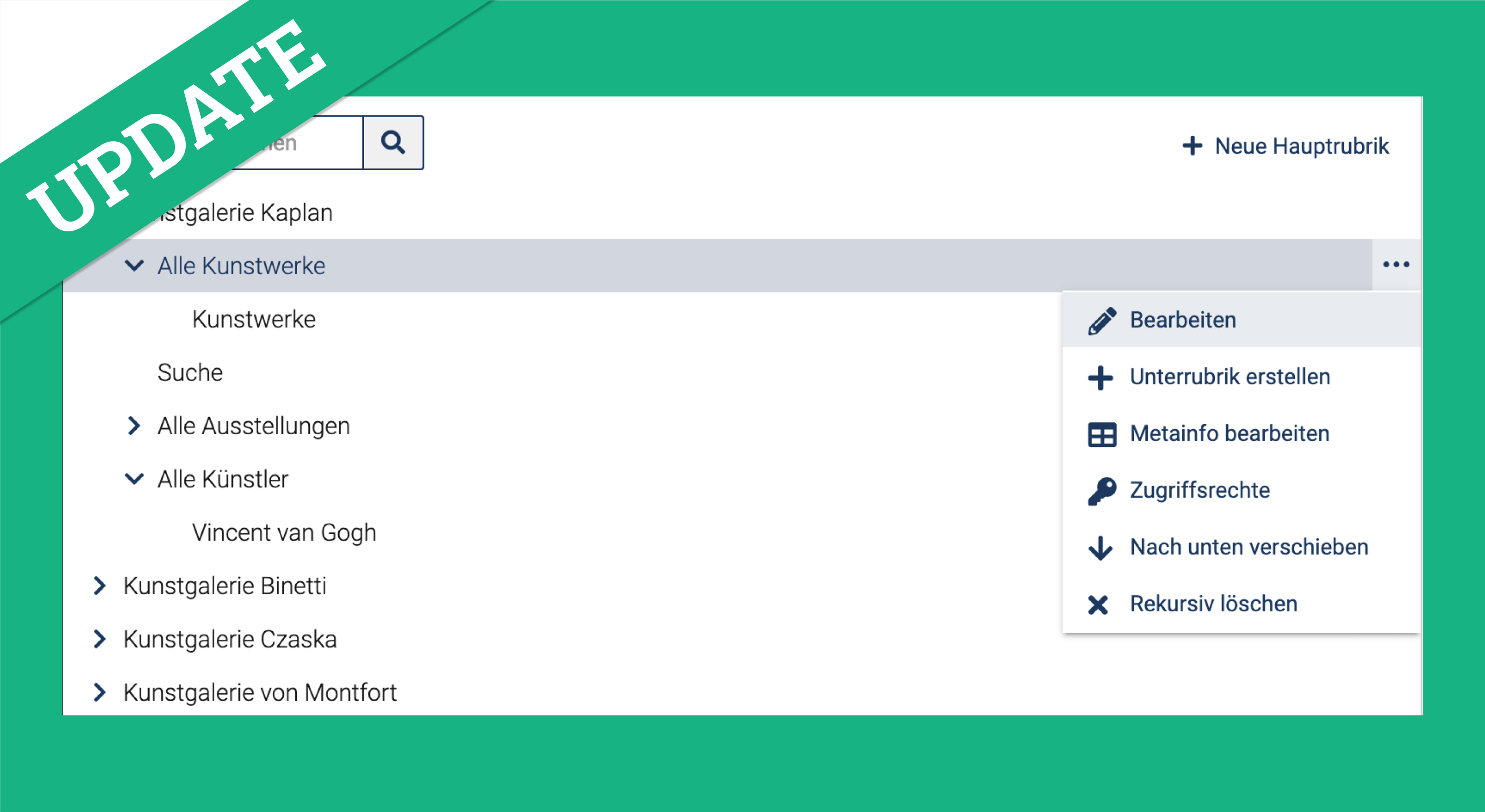
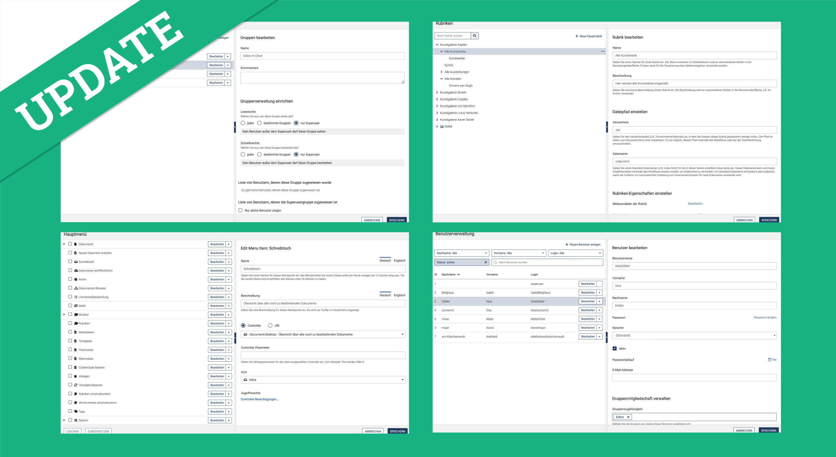
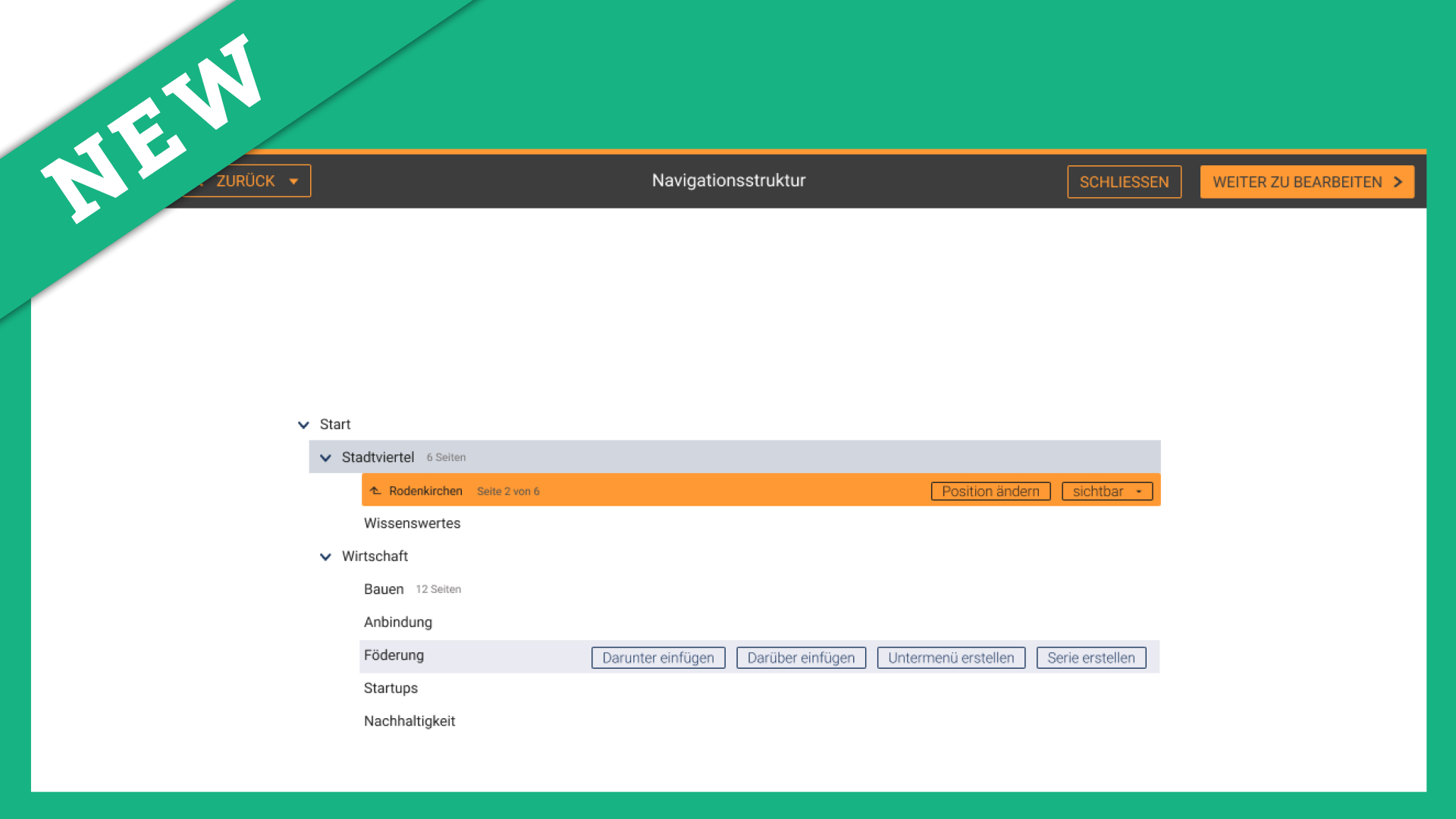
In imperia 11.3 we have put a special focus on making the existing UI design cleaner and easier to understand, so that users of imperia will find it easier to use. The "tidying up" work began, for example, with the display of the menu tree, which we have visually enhanced with fold-out arrows, continued with the arrangement of headings and labels and ended with a general reworking of forms with larger line spacing between fields. One of the most significant changes is the 2-column panel view, which we have firmly integrated into the pages of the system. Thanks to the greater division into individual sections, content is now presented in a more structured manner and is easier to find.
In order to better distinguish individual sections from each other, we have broken up the previously existing list view in some places and replaced old checkboxes and radio buttons with clearer text boxes. These can now be activated via toggles. The access rights have also been adapted to the new design and are now based on a recurring pattern. In addition, there is now also a subdivision into rubric and document authorisations for better clarity.
As it was not always clear what information was requested in some fields in the previous version, we have added helping texts to make it easier to fill in. Extended content fields will now only be queried if an appropriate pre-selection has been made in order to streamline the overall selection. Another important change in 11.3 is the reminder about saving content. In the previous version of imperia it was possible to make a change, for example, in the rubric tree and then switch to another area. However, if you forgot to press "Save", all changes were lost. We have solved this problem with the new version: If you switch to a new section and have not yet saved your changes, an automatic dialogue box opens to remind you to save your changes.
